Categories
Authority Site Catalyst WordPress

Using Catalyst Theme To Build An Authority Site

The original title of this site, when it was on blogger, was building an online income one website at a time.  I figured I’d need about 100 websites.  I’ve hung onto the niche website model for longer than most. I may well go back to it. But at the moment I feel like I’m swimming against the tide too much, and I’ve decided to build an authority site – just to see what happens – oh and to make lots and lots of money (of course)! 

I’ve already have one authority site – this one – but I built it my accident, I want to build this one deliberately.  As  Regev asked a question in my last Catalyst Theme Review  I thought it was time to add a bit to that earlier review – by describing how I used the theme’s flexibility allowed me to achieve what  I want to do now, and how I can evolve the site  to what I want in the future, without a complete re-design. 

The Two Main Types of Travel Readers 

In my view, there are basically two types of people who read travel articles, be they blog posts or magazines: 

  • armchair travellers, those reading about a places that they will probably never visit (or not in the next year or two).  In the blogging sphere these are people skivvying off work, trying to keep the dream alive, or just escaping; 
  • those that are actually actively fact gathering for travelling. They may still be at a high level planning stage (how much money does 6 months in Thailand cost?), or they are getting quite a lot closer to departure (budget hotel near airport. Bangkok). 

Most published guidebooks cater for both. In fact the DK Eye Witness Travel Guides (some of the most beautiful guidebooks IMHO) – are pretty much designed for armchair travellers, unless you are using a porter they are far too heavy to actually travel with! Most travel addicts have at least one guidebook to a county they never quite got to! 

Most blogs only cater for just one of these groups –  often un-intentionally.

First there are those who are either gifted writers or just excited about documenting their trip know little about SEO, end up writing blogs which are great reads, but not very practically focussed.  Unfortunately most of these probably never find an audience because the writers have no idea how to promote their work. Writing and they will come still isn’t a great strategy as far as I am concerned, but if you are not writing keyword focussed content your odds of succeeding are minuscule.  To get this to work you need to be doing a lot of social media promotion. 

On the other hand there is also a number of travel blogs which were setup as, or evolved to, being mainly about practical fact gathering, often very focussed on SEO.   Some are quite fun, but then they go on a sponsored trip to “insert country you have no interest in here”, and you lose interest because its all about XYZ for months on end. Some of these sites also rely heavily on social media, but some too use a lot of SEO. 

What A Travel Site Needs To Have IMHO 

No surprise where I’m going here – I wanted a site which allowed me to reach both the “armchair travellers” with a range of amusing stories, and photos, and maybe even videos, which would get them interested in visiting a country.  Plus I wanted to use my knowledge of SEO and some specific travel destinations to write practical, “how to” style articles. I could see no reason why I couldn’t do both.  But I did need to think about how to design a site so I could regularly update both a  “travel blog” plus specific focussed “how to content”. The how to content needed to be easily found, without being in the face of the casual reader.  

I wanted to be able to feature photos. To me a travel blog without photos, is missing out on, a lot. You just gotta have the photos in my opinion. If nothing else it gives some credibility to what you are talking about.  I also wanted maps. Maybe I’m just a map geek – but I like to look at maps and I use maps for travel planning. 

I wanted clear menus and categorisation, so that visitors could find things easily. 

I wanted flexiblity to focus some categories as a silo – offering specific advertising and offers which only relates to those particular pages. Why would an advertiser of Thailand Vacations want to advertise on an article about Canada? I wanted it easy to do this.  In fact the more I looked into it the more I could see that category and tag pages are greatly under-utilised resources in many blogs. 

Using Catalyst To Design A Hybrid Travel Site 

Catalyst Theme - WordPress Accelerated

Basic Design Choices

I decided to use posts for almost everything except for genuinely static pages (Privacy Policy, About, Contact and similar).  Basically that’s because I want almost all my content to go to my RSS feed. I’ve found that content that I’ve added which is neither linked to from the front page OR the main navigation, still gets indexed quickly. The only reason for that is because its in the RSS. 

First I designed the categories up front. I needed a specific category for “travel blog” because not all of my posts were going on the travel blog.  I grouped a lot of my destination content around fairly standard geographic divisions. Designing categories gave me the main navigation of the site. I do NOT “no index” any part of my site including category and tag pages. Tag pages often rank first, before my post, so I find them useful “bell weather” indicators. Categories I have big plans for – see below. 

My tags are not designed up front. I use tags on pages where I’m targetting specific search terms, plus as a way to cross reference photos to be including in the relevant destination searches. 

I wanted a clean nice looking site, which wasn’t too cluttered, but not too bare either. I don’t think minimalism works for travel.  On the other hand I am no designer so I wanted something that I could just use. 

Implementation: I picked the “Greenfields” skin for two reasons 1) I liked it 2) It’s free. The only thing I’ve really changed is that I thought the header was too deep and took up too much space above the fold so I reduced it a bit. I also didn’t implement the slider because I wanted to use more space on the front page featuring various parts of my site (blog, photos, key destinations etc). 

I wanted the site to look good on other devices rather than just computers e.g. tablets, smart phones. 

Implementation: Latest version of Catalyst allows responsive design (which is what this is called) with a click of the button – lucky as that’s all I know about it ! 

I wanted to use a static front page (rather than current posts), because I wanted to provide and overall view of a site that was bigger than just being a “travel blog”. 

Implementation: Used a static welcome page layout “wide left 2 3 3”. The header image is actually a top widget, so I can remove on certain parts of the site if I wish to, and similarly the bottom gray footer is also a widget area which can be dropped from parts of the site if required. 

Specific Page Types and Layouts 

Catalyst provides a  specific blog template. Create a blank page – give it that template, add a specific page layout – voila – a “blog page” 

Implementation: Under core options you can chose which categories of post show on your “blog page”.

Page layouts is where the power of Catalyst really shines. Basically any page or post can have any layout and any layout can have widgets and other content anywhere on the page. It gets confusing – so briefly here are some examples. The blog page above is using my standard layout with standard excerpts and a sidebar. 

Implementation:  Each layout is setup first with specific widgets on that page. You then populate those widgets with the code you require. I use a limited amount of CSS in order to float widgets within content e.g. to display Adsense with Catalyst. I also use CSS to suppress metadata on my evergreen content (Catalyst will let me turn it off or on for all posts – but I only wanted to show dates on some content). 

Other variations of page layouts  I’m using include: 

  • No advertising on irrelevant pages e.g. Contact 
  • Standard advertising using widgets on most pages – see any blog post. 
  • Full-width layout on some pages where I want to focus on the content: Packing List Book 
  • A different full-width layout for travel photos. 
  • Specific Thailand Category Page  – I’ll use a similar design for other destinations in the future. 

Specific Category Pages 

With Catalyst you can specify a particular page to display for each category. I’m using this feature to allow me to add value to my category pages, by mapping posts to a local geographic map at the top of the page, and then using excerpts below. In future I could replace the sidebar with relevant advertising for this region too. This is basically a development of the process of replacing the Post Page Associator plugin I’ve described previously. 

Catalyst Theme - WordPress Accelerated

This is a continuing series about developing an authority site. The next post will probably be about finding new keywords in your analytics – stay tuned. 

Categories
Catalyst Paid Tools WordPress

Catalyst as a Post Page Associator Alternative

I’ve used Post page associator plugin for a while. Its a handy plugin which allowed you to do what it says on the pack; add a list of your posts in a certain category, at the bottom of the page. I used it here for example

However the developer has been under criticism for included a “please donate”  large ad on your main dashboard if you hadn’t paid – in fact I had give a donation – but I was buggered if I was going to donate for EACH blog I used it on – so I found the advertising a little annoying.  There was toys tossed in the WordPress forums though, some users found the nag VERY annoying,- and the developer has taken his toys home – or in this case made the plugin paid only (and quite expensive at that).

Free Option: List Category Posts Plugin 

You’ll find this plugin if you search on the install plugins page. It works – you add a short code somewhere in a page where you want the listing of posts to occur – and it does. Now there are a bunch of options, but making it look pretty involved php and css and stuff – so I ran screaming… 

Paid Option: Using Catalyst Theme As An Alternative to Post Page Associator Plugin

This really was quite simple – no scary TLAs involved! 

  1. Create a new page layout – I called mine indienonfiction.
  2. Decide on the layout of said page – I decided it would have a single right sidebar. 
  3. Added a new widget to the bottom of the content on the indienonfiction page layout. 
  4. Went over to the widgets area – used the Catalyst Excerpts widget to display the 100 posts in the category of non-fiction. 
  5. Added some relevant content to the new custom sidebar 
  6. Voila – a New Indie Non Fiction page – with all my posts from the Indie Non Fiction category displayed at the bottom. 

 Of course its not a free option, unless you already own Catalyst Theme, but really I wouldn’t be paying $30 PLUS $9/month for support  for a plugin when I can pay once for an entire theme framework for under $1o0. 

Oh and in case you do want to buy Catalyst: 

HONKING BIG AFFILIATE LINK HERE 

Catalyst Theme - WordPress Accelerated

Categories
Adsense beginners Blogging Catalyst Paid Tools Product Reviews Tools

Catalyst Theme and Adsense Review

OK this is another instalment in my collection of articles about how the premium WordPress theme Catalyst: it may not be free but it allows even the technically terrified to  do cool stuff!

On of the things that I like about Catalyst is that its one theme that I can use for everything – from a mini-site to this site, to a client’s professional site. I use Catalyst for all  of them. Today I’m concentrating on using Catalyst with Adsense.

Now there are plenty of WordPress plugins that promise to manage your Adsense easily with any theme. But plugins have their own issues- every plugin you add to a site adds a level of complexity and invariably need upgrading every time WordPress upgrades, and sometimes they break and sometimes they even send a quiet percentage of impressions to their author’s Adsense publisher ID!

There are a number of ways to deal with Adsense using the Catalyst theme – I think I have the simplest – and I will point you to a couple of alternative solutions at the end of this post.

How to Manage Adsense on a WordPress Blog

My Dutch is about at the same level as my php - I can recognise enough to order lunch but I don't speak it!

My requirements for when I want Adsense to show – and more importantly NOT to show on my websites come straight from the terms of service provided by our friends at Google.

  1. I only want to display at most 3 ad units and 3 link units on any one page.
  2. I don’t want to display ads on “filler” pages such as the privacy policy and “thin” pages like the “about” page.

More specifically I want:

  • to have a front page which consists of my last 3 posts;
  • a link unit in the header to show on all pages and posts except the “filler” and “thin” pages;
  • a honking big rectangle of ads to show near the top of each post  floated right in the text – including the 3 posts on the front page;
  • I want an ad block to show at the end of the post and in the sidebar – but only on single posts – not on the front page.

Now if  you know php you will be already shouting something like “use php if single command to only display on single posts” – but remember I’m an idiot and I don’t know anything about php, I struggle in html and  my CSS only got fluent since the last upgrade of Catalyst gave me the brilliant – “hold your hand point and click CSS builder” thingy.

Adsense Using Catalyst Theme Layouts

If you are used to free themes you may expect that every page and post has to have the same basic layout of sidebars and widgets. With Catalyst there is no such limitation, Every post and page can have a different layout.

Catalyst allows you to create an unlimited number of layouts – each of which can have a different arrangement of widths, widgets, sidebars – anything really. I use a combination of custom widgets and layouts to control where my Adsense ads show. This involves no php coding and a very little CSS –  it goes like this:

  1. Create a custom layout  called supportpage – this is for use of the privacy policy and about page. After creating the layout – you need to edit each page or post that you want to use the new layout by changing the drop down below the edit post area. Now you have a simple layout for these ancillary pages – job done.
  2. I also create a layout for each post page I want to display Adsense on – this I called “postpage”.
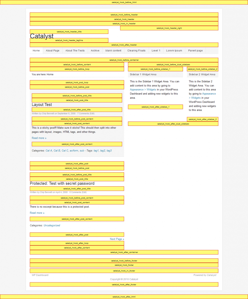
  3. Now for the custom widgets – I create three widgets: bottominpost, rectangleinpost and headerlinks – I think you get the idea what I might be putting in these! Each custom widget is hooked into a different place on the catalyst theme – a hook is just where you attach a widget into a theme – that’s how I have the yellow boxes below the header on this blog – there an awful lot of them – here is the visual for the main default catalyst home page hooks! 
  4. For each widget I have the option as to which of my layouts I want to use the widget on: so I control that none of these widgets show on the supportpage layout – but the headerlinks  and rectangleinpost widgets shows on the default and the postpage layouts and the bottominpost layout shows only on the postpage layout. You may be getting the idea about now – using descriptive names is good- because you end up with a lot of widgets!
  5. Now this is the techie bit – sorry – you need to click on the custom CSS option. The only thing we haven’t done yet is made sure that honking big rectangle of an Adsense ad floats right within your text – you can build what you want with the CSS builder option (this is a good place to change the colour or other styling of a widget too!) – or you can steal my code -here its is – suitable for the large rectangle Adsense layout:

    .rectangleinpost {
    width: 340px;
    height: 284px;
    float: right;
    padding: 2px 0px 0px 2px;
    }

    Now head over to your widgets page and drop text boxes in all your new widgets – into each text box drop the correct piece of Adsense code – job done!

Bonus – using the layouts will give you a new sidebar (if you chose that option) on your posts – so you can toss another tasteless skyscraper Adsense block in there as well.

Adsense on Catalyst Using Hook Boxes

Costa’s post on How To Create An Adsense Optimized Child Theme will walk you thru this one- must admit that post meant I kinda  understood hook boxes for the first time too! But it has that scary stuff php again …

Adsense on Catalyst Using Widgets

RT an American living in the Philippines has a similar approach to mine and wrote How To Display Adsense on a Single Post with Catalyst Theme as a guest post for Costa. But because he isn’t using layouts he’s forced to use the evil php stuff in his widgets – ugg!

Seriously there are lot of ways to achieve the same result in Catalyst –  all of these approaches will get you to the same place – but your mileage may vary depending on your skills and exactly what you are trying to achieve.

I actually think the use of layouts is really powerful – if for example you wanted to have different advertising (or no advertising) on different types of posts – e.g. some of your articles may suit Amazon ads – while others will have an affiliate offer or Adsense. In fact I may play around with something like that on this site – keep watching 🙂

I tell you what however you do it – once you have used the power of a decent framework theme like Catalyst you will NEVER EVER want to edit theme’s code again – just avoiding the whole drama of upgrading and losing all your customizations is so worth avoiding!

Oh and yeah – honking big affiliate link for Catalyst here! I’d be curious to hear from others doing something similar with a fancy theme – or are you all using plugins?


Categories
Blogging Catalyst Paid Tools Product Reviews Tools WordPress

Catalyst Theme Review

Yup its all changed around here again! Well not the content just he look and feel (ie if you are reading this via RSS – click thru !). I had hoped that going from Thesis to Frugal would be my last major change.  However Eric Hamm -the guy who created Frugal – upgraded the product so much – it now has a new name – Frugal is now Catalyst !

Catalyst actually came out just before I took off for a 2 month overseas trip with a 10″ netbook – netbook are good for lots of things but doing site design is not one of them!

When I got back I had a look at Catalyst and upgraded some of my niche sites with it. I liked it – but it didn’t have Frugal’s easy to install front page – with a wide choice of widgets. So I  didn’t upgrade this site. Then back in February Catalyst upgraded to 1.1 – and YES now there are EZI Widgets – which allows a flexible front page – like Frugal’s – but with even more options!

Still I hesitated – this site is a pain – it has a number of different looking posts and pages,  I didn’t really want to think about it.   Finally though I had to bite the bullet and get on with upgrading from Frugal to Catalyst – why?

  1. They have a discount for new sign ups of 25% (and incentives for affiliates) – so use the code: CATWP25when you sign up HERE – discount good to the 31 March 2011; (And yes I get an increased affiliate percentage in March too…);
  2. I think I can add value to Catalyst and do a series of tutorials here that will help the CSS-incompetent, design-disabled of you – you know people just like me!

I’ve already done a post on Catalyst’s SEO Options and I also what to talk about how to use Catalyst with the Keyword Academy’s Postrunner and also how to use it as a static site rather than a blog.

But I guess I should explain how I adapted the look of the site here.  I could have reproduced the look of the old site – but I decided to keep the general layout but change up the details and the look of the site.

From an SEO point of view its important not to make huge overnight changes to the main pages of your sites – or if you do be prepared to accept that your ranking will fluctuate until Google comes to terms with the changes.

How To Make a Catalyst Site Look Like This Site.

  1. Install Catalyst 1.1.1,  then install dynamik child theme and activate it.
  2. Go to dynamik options/import/export – and play around with installing some dynamik skins until you find something you like (I think this is fluid blue).
  3. I kept the same top navbar – but used a custom menu which is new in WordPress fairly recently – much easier to manage the order etc than remembering to change priority on individual pages.  Set the option Core Options/Navbar
  4. I dropped the header image – instead the header is plain text. The graphic of my sitting on the beach is a no-repeat image in the body background.  I played with the header dimensions until they were something that I liked – 930px x 75px
  5. To do the front page and also some of the featured content: I used Ezi Wiidgets and setup a front page with 1/1/3 layout PLUS 2 feature widgets above the content (not showing on the front page but they do on other pages) PLUS a “fat footer” of 4 widgets. Each Widget can be styled separately so I add a custom style to the top of the front page and use Custom CSS to make its background yellow. The middle widget  and the bottom three widgets on the front page are all featuring a single page (excerpts in the case o the bottom 3). This is why Catalyst is so easy to get up and running with – widgets are easy to rearrange and the Catalyst specific excerpts widget makes it easy to feature content from a specific page (an improvement on Frugal where you tended to write the content in text widgets which doesn’t have enough spell checking for me.)
  6. Although much of my site has a single right sidebar some major pages I prefer to minimize distractions on so they have no sidebars – for example any of the pages on the top navigation or the 3 along the bottom of the front page.  I use Advanced Options to create a custom layout with no sidebar – and then edited each page to use the “nosidebar” layout I’d just created.
  7. I’ve put most of my signup and navigational aids in the fat footer which is throughout the site -maybe its a mistake – no one will ever sign up again – but I prefer that stuff out of the way.
  8. I used 2 Ezi Top Feature widgets to create the two boxes highlighted below the header (again with custom CSS to change the background). These I chose to display on posts but not pages.
  9. I created a custom widget which shows grey at the bottom of my posts to display my TKA advertisement.

Hope this helps for someone who is trying to combining a fairly general blog with some rather specific pages!

Categories
Catalyst Paid Tools WordPress

Catalyst Theme and SEO Options

From time to time I mention the theme I like de jour – but my most abiding love affair with a theme is Frugal Theme – now replaced with Catalyst Theme – and I like them both! (Well sort of replaced I haven’t got around to doing this site yet – its still in the “not broken – haven’t fixed it yet”) pile. But with the release of Catalyst v1.1 I am pretty darn impressed and even WordPress 3.1 is appearing to be stable enough to upgrade to – so here’s my first Catalyst Theme Tutorial.

So how is Catalyst for SEO – well its pretty good – its flexible, it won’t do it for you – but you can set and forget it. First if you are already using a plugin such as All-In-One-SEO or Platinum SEO – then you can keep on using them, they play happily with Catalyst 1.1. However if you are starting a new site – you can probably skip the plugins and just use Catalyst’s built in SEO.

Once you’ve installed Catalyst and the Dynamik child theme – you will have a Catalyst Sub Menu on your main WordPress menu and under that three options: Core Options, Dynamik Options and Advanced Options.

Go to Core Options and Chose SEO (if you are using a SEO plugin at the top of the page will be a warning telling you that anything you do will be ignore).

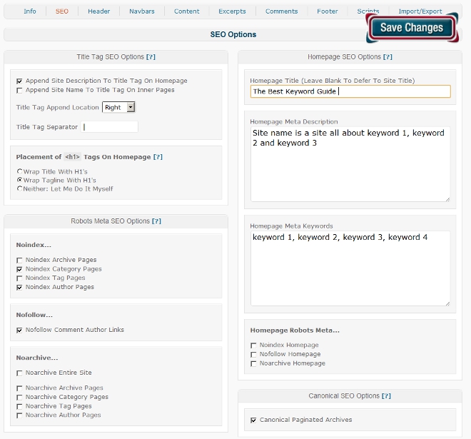
Setup Site Wide SEO Options in Catalyst

That’s how I do – it but you have got some options:

Title Tag SEO

Title Tag: – you probably want to append the  site description to your title tag – but on the right – (words nearer the left are considered to have more weight in SEO)

If you have a keyword rich site name then you should probably append it  on inner pages – if however you have a general brand name then don’t bother.

You only want ONE H1 tag on the front page – your choice whether its title or tagline.

Robots Meta SEO Options

I  vary on this but I never check NOINDEX on tags or archives – I find them in the SERPS too often. The author page is irrelevant on a single author blog –  so I do check NOINDEX on it and sometimes on Category.

If you want to have comments do-followed you can uncheck this option rather than installing the do-follow option.

I don’t Noarchive anything.

HomePage SEO Options

Generally I use this blank and use the site title (under Settings/General menu)

Homepage metadescription – is helpful friendly, something that may make someone click thru – but has lots of keywords in it too!

Obviously put your keywords in the homepage meta – it probably doesn’t do anything but…

Homepage Robots Meta – all unticked.

Canonical paginated archives sounds like a good idea – to be honest I’m not exactly sure what they are though!

Up to now these options will apply site wide.

In addiition on every page and post in Catalyst you have another bunch of SEO options (under the main editing screen) these include

Catalyst page title

Catalyst description

Catalyst keywords

You can also noindex, nofollow and/or noarchive the post or page.


Interested in learning more about Catalyst – HONKING BIG AFFILIATE LINK HERE