I’ve been running Chris Pearson’s Thesis Theme on this site for a while – last July I installed Thesis. As I talked about in my last post : I am now running Frugal Theme not Thesis.
Why I Chose Thesis in the First Place
I am not a designer I know little CSS far less php, enough html to get by. But I wanted to be able to develop custom websites – not just for my own use but also for SEO clients. Thesis seemed to offer the promise of doing this without coding – their advertising is based around that, At the time I bought Thesis there was no money back guarantee – so I wanted to make sure I got it right. So researched, and then bought Thesis 1.4
I was never impressed with Thesis and although I bought the $87 single use licence intending to upgrade to the multi-site use Developer’s version I never did. Instead I bought Elegantthemes for my other sites and retained Thesis here. I think my relationship with Thesis soured when I had to go their support forums to learn how to install my own header image and change the site’s background colours to match.
The Boxes Thesis Failed on – Is Frugal Any Better?
Originally I decided not to upgrade to the developer’s version of Thesis for the reasons I listed in this September 2009 post about Thesis. I recently updated to Thesis 1.7 and my issues still stand – so I have reproduced my original problems with Thesis and compared Frugal with the same issues. Yup this is genuine review of Thesis 1.7 and Frugal 3.3 from someone who has used and abused both. The Thesis comments below are my original September comments – and then I’ve followed them with my take on how Frugal Theme stacks up.
THESIS: It has not one but two Thesis Options panels – this is confusing – I am always going to the wrong one – even after months. Actually its up to five now plus the Thesis Openhook plugin – which always felt like functionality which should have been in the base Thesis install. But to be fair – this was my first experience with a sophisticated Framework rather than a simple theme – it took some getting used to!
FRUGAL: Frugal installs a 6-option menu which I find quite simple to work my way through. The excellent videos from the developer Eric Hamm describing each and every option are extremely useful.
THESIS: I had to use code to add a header image and to match the background colour. This is the single reason why so many Thesis installs look like a default Thesis install.
FRUGAL: For comparison purposes I’ve included a list of Thesis and Frugal themes sites at the end of this post – just to show what “non-designers” can do with these themes. But the bottom line is that its really easy to add a header and then change the background colours of Frugal – much, much easier than it is with Thesis. If you can do these two things you can make your site look unique!
THESIS: Using images is painful – I have to import an image and then cut and paste and add the thumbnail image code so that I can have the combination of having a picture anywhere I want in the picture plus having the thumbnail appear on other pages such as categories – its a nuisance. (Upgrading to 1.7 made this even more painful as I had to scroll a LONG way below the post past all the useless javascript libraries to get to the thumbnail options.
FRUGAL: Thanks to Thesis 1.7 ignoring the functionality of WordPress 2.9 native’s support of thumbnails I’ve had to go thru my past posts and nominate an image as a thumbnail – but going forward – images are very straightforward – import the image into the post – nominate as a thumbnail – job done!
THESIS: Thesis is expensive if you want to deploy it. If you want to run it on more than one site you need that developers editions – that’s another $77 over the initial $87 for a single user. Plus if you want to sell a customised theme to a client that’s another $15 now $40 per a client theme.
FRUGAL: Exactly the same pricing! For one site $87 for a single site or $164 $164 for a developer’s licence plus $40 per a client site. I notice that both themes now have a 30-day money back guarantee – something that Thesis didn’t have when I bought it. Nice to see competition doing its thing. Honestly I think Frugal should be a little more aggressive on their pricing in order to differentiate themselves from Thesis – once they have the market share they can then up the price – but until then – just my opinion though!
THESIS: Thesis makes a big deal of being SEO friendly – but its SEO settings are no more difficult to use than the free all-in-one-seo plugin – it replaces that plugin – but most people would already be running all-in-one anyways.
FRUGAL: Is just as easy to set up for on-page SEO- if not more so (the defaults are much better than the Thesis defaults for SEO). I’ve seen Frugal Theme criticized for its SEO this over and over – there is no issue that I can see Frugal is just fine for SEO (and replaces All-in-one-SEO or Platinum SEO plugins).
THESIS: if you are a designer Thesis really is a framework and you can no doubt do beautiful things -but its a bit like giving me a top-quality blank canvas and a paint brush and tell me go create – I am a rather more paint by numbers gal! You maybe able to do beautiful things with Thesis – or afford someone who can – I can’t do either.
FRUGAL: Frugal is astoundingly easy to to customise for a non-designer. It is dead simple to produce a site which looks like a website not a blog. Its astoundingly easy to customise the look and style of the site. Its everything I hoped Thesis would be when I bought Thesis 1.4 and which Thesis 1.7 has still failed to deliver on
THESIS: The ability to display ads using the “multimedia” box is fine and the ability to control this down to post level is impressive. What’s not is the place you put the code shows at most 2 lines of a narrow column- you have to use a text editor to actually edit and update the code – this is because most of the screen space has been used on the unecessary design elements.
FRUGAL: There is not quite the same concept as the multimedia box in Frugal – but you can do custom layouts for pages and the ability to add custom widgets at almost any point in the design – so I am experimenting with this. I’ve gone away from the standard 125×125 ads in the sidebar anyways – they use up a lot of space and rarely converted. Frugal Theme’s use of and implementation of hooks is brilliant – its a difficult concept but a truly understood it with Frugal – never had with Thesis. The fact that you get dummy text when you hook in widgets to hooks is fantastic for those who are learning this stuff (like me and most of their customers).
THESIS: Their affiliate banners are really. really ugly – yellow is the only option – and this is in the marketplace where people care about design. This may have changed with the outsourcing of their affiliate program – I’m not up to date but Costa at Bloggigs is not very impressed with the new Thesis affiliate program for international affiliates
FRUGAL: In-house affiliate program which pays 40% to affiliates running on the iDevAffiliate platform which I’m seeing more and more often (TKA uses it too). Nice set of pretty banners – like this one 🙂
On Going Thesis Development Issues
Since I raised the issues above in September I have found Thesis continues to annoy. Because I chose to have images in my posts in different places in each post – there is no way that I can create an automatic thumbnail for each post – which is used in the extracts of older posts (a feature I really like with Thesis, but is easier to use with Frugal). Instead, after importing an image to a post, I had to go to the advanced setting of that image and cut and paste it in the thumbnail url below the post – and then edit it to reflect the actual thumbnail name!
The latest version of Thesis – made this worse by adding a whole bunch of JavaScript libraries immediately below my post’s editing area – which I now have to scroll past to get to the image urls and options.
Thesis seems to be loosing the plot with what features are released when. There was an active debate in their forums expecting that Thesis 2.0 would be out in September 2009 – and that it would have such innovations – such as easy point and click to change the header image. Still waiting on that easy header change AND Thesis 2.0 – but Thesis 1.7 has a whole bunch of javascript library options? Sorry but WTF – although its true that customers don’t always know what they want – but wanting to change a header image – thats pretty darn basic! Because if you can’t retain your customers they are going to go elsewhere – and the options are starting to improve – not just Frugal but Headway too.
Which is Best Frugal or Thesis
As my readers know I don’t mind calling a spade a bloody shovel and I think Thesis is slipping behind. The risk is though that its winning the marketing war – the line up of “big” name A-list bloggers really does seem to impress people into the desirability of buying.
I don’t know how much longer that is going to work though – I think Thesis has made three key mistakes:
- they haven’t listened to their customers and responded to the customers fairly basic requests (e.g. easy custom headers);
- they do now provide a 30 day guarantee so that people aren’t “stuck” with the product that didn’t live up to the hype;
- they have pissed off a whole lot of their affiliates – eBay has discovered that pissing off the people who bring you traffic is dumb idea – it looks like Thesis is going the same route.
Frankly Thesis hasn’t kept an eye on the competition. Frugal does everything that Thesis sold itself to me that it would deliver on:
- easy to customize without knowing css and php;
- easy to upgrade and modify as my site developed ;
- easy to deploy for my clients and to maintain for them (or preferably, teach them to maintain).
Frugal Example Sites
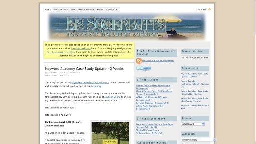
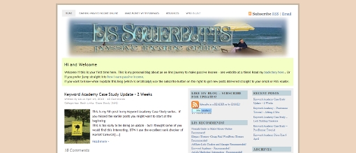
Terrible for SEO – but different Jim Chao
Used as a CMS rather than a blog – variety of different page styles Real Estate Leads
Leo is running Frugal on his Internet Marketing blog using a static front page layout which I may adopt.
More “standard Frugal” – but still unique enough Living Frugal Tips
An in your face design who seems to have upgraded from Thesis to Frugal for similar reasons as I Enemy of Debt
Zen Habits – no introduction required I think. There is a free skin available from Frugal based on Leo’s blog’s design (with his permission).
Thesis Example Sites
Most of the Thesis sites I found using a “powered by Thesis” search – found me SEO ‘s sites – Thesis is loved by the SEO and design community because of its promotion by the “A-listers” and its opportunities for consulting by writing e-books on how to use Thesis and custom designs for those who give up on the books.
Friction Marketer again a basic Thesis look – well worth reading the article linked to from the point of view of Brian Clark’s social media skills. (BTW that was September 2009 Brian is talking about the release of Thesis 2.0 – it hasn’t happened yet).
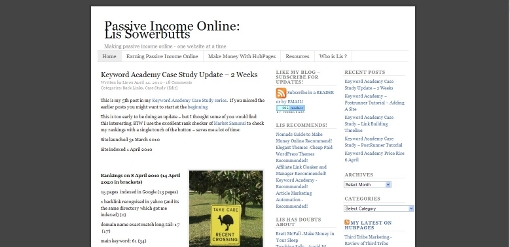
R James Horne – the classic “Thesis look” – sorry James !
Even More classic Thesis (sorry Steve!) Social Media
These are more sophisticated Thesis “looks” – but would have taken quite a bit of custom code to achieve:
SEO Pitfall
Quick Online Tips
Simply
Frugal Theme Reviewed Big Thumbs Up
Sorry – the post is a bit long even for me! But I really found it an interesting comparing Thesis and Frugal – one should have the first mover advantage (Thesis), both obviously have extremely talented developers – but one (Thesis) has outsourced their marketing to the A-listers, the other (Frugal) is going it alone and trying to build a good affiliate network. Frankly one of the reasons I took so much time on this post (and it took days) was that I have seen very few in-depth reviews of Frugal – and came across some downright misleading stuff (like the so-called lack of SEO). This is my attempt to fix that (oh and get a bit of affiliate income too!)
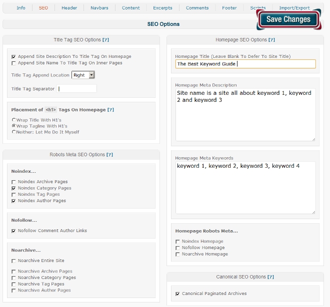
 So how is Catalyst for SEO – well its pretty good – its flexible, it won’t do it for you – but you can set and forget it. First if you are already using a plugin such as All-In-One-SEO or Platinum SEO – then you can keep on using them, they play happily with Catalyst 1.1. However if you are starting a new site – you can probably skip the plugins and just use Catalyst’s built in SEO.
 That’s how I do – it but you have got some options:


