Update April 2011 – I have updated the theme again – Frugal became Catalyst – which is a really, really turbo charged version of Frugal -which I got a free upgrade to as an existing customer. To read more about Catalyst check out my Catalyst review
Hi all – if you click thru and get your yourself onto the actual site – you will see some stuff has changed around here! I am still getting the edges smoothed off but Passive Income Online has had a spring clean and is now running the Frugal Theme by Eric Hamm.
I have a (very) long post coming out in the next few days describing why I decided to move away from Thesis ( a theme I’d already paid for) and install Thesis Frugal – this is the short version in case anyone happened to notice (or care) about what happened around here.
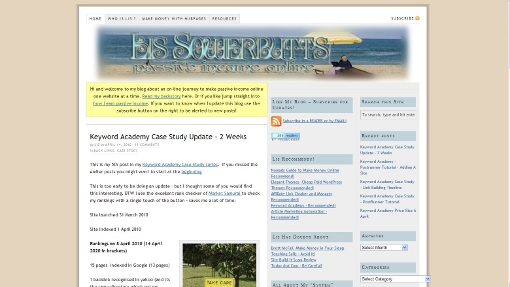
In case you have already forgotten: this was this site running Thesis 1.7:

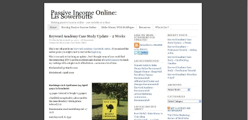
After a bit of practice with Frugal (I’ve owned if for a couple of weeks) I took the deep breath and installed it here. Out of the box – i.e. just after I hit activate after uploading the Theme I had a site that looked like this:

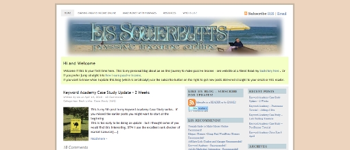
It took me a couple of hours – and I had written down the details of the design from the Thesis install. But I now have a site which at least resembles what this blog looked like with Thesis. I’m going to change it more – but I thought I would be too radical to start off with just so people didn’t think they’d wandered into the wrong site!

If you want the gory details of how I did the customisationisation without writing a single line of CSS code and very little html. This is the short version.
- I made sure that I had the custom header which was kindly given to me by Costa over at Blogigs: WP Easy Customization Tips.
- I trawled thru the custom CSS being used in Thesis plus the font and design options and wrote down little details like fonts and sizes and colour codes for the backgrounds, fonts and other shite.
- I installed Frugal 3.3
- I was impressed that Frugal preserved my existing sidebar arrangement complete with widgets.
- I easy fixed my top of page navigation which has been broken since I upgraded to Thesis 1.7.
- I had read the Frugal manual and watched Eric’s excellent videos so knew that I could use his custom widget functionality to add my yellow welcome box at the top of the page (I chose to change it so it was full width not just above the content column as in Thesis – it was easy to change by choosing a slightly different hook).
- I also used a custom widget to add a the blue box at the bottom of posts promoting The Keyword Academy.
- I have to go through each post and add a thumbnail. I wasn’t surprised – Thesis 1.7 was suppressing the WordPress 2.9 functionality of thumbnails so I knew I’d have to go back and fix a pile of posts. The good news is that from now on to add a thumbnail all i have to do is click that option when I import an image – not more cutting and pasting image urls yeah!
So far there are two things that I can’t find a way to reproduce with Frugal:
I quite like the single post followed by excerpts of older posts which Thesis does. Frugal well let me have 3 excerpts below the main post – but I haven’t found a way to do more than three (without code – I’m sure I CAN do it with code but that’s not the point)Confirmed by Eric (the developer and owner of Frugal) that I will need to look at a slightly different layout – given that some of you commented you hadn’t realized I’d changed themes thats cool;- T
he comments on pages appear to have gone AWOL – not sure how to get them back!Answer go to the “main options” page and select comments on pages and posts options – duh!
