Update April 2011 – I have updated the theme again – Frugal became Catalyst – which is a really, really turbo charged version of Frugal -which I got a free upgrade to as an existing customer. To read more about Catalyst check out my Catalyst review
Hi all – if you click thru and get your yourself onto the actual site – you will see some stuff has changed around here! I am still getting the edges smoothed off but Passive Income Online has had a spring clean and is now running the Frugal Theme by Eric Hamm.
I have a (very) long post coming out in the next few days describing why I decided to move away from Thesis ( a theme I’d already paid for) and install Thesis Frugal – this is the short version in case anyone happened to notice (or care) about what happened around here.
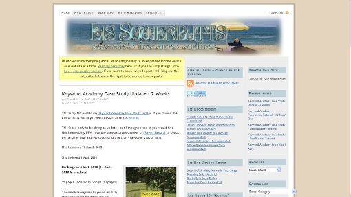
In case you have already forgotten: this was this site running Thesis 1.7:

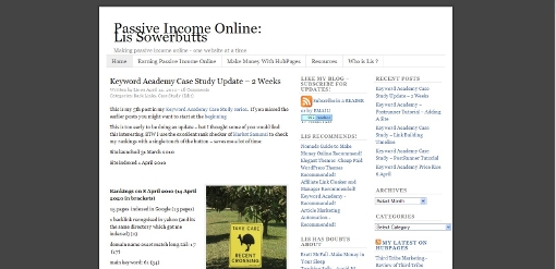
After a bit of practice with Frugal (I’ve owned if for a couple of weeks) I took the deep breath and installed it here. Out of the box – i.e. just after I hit activate after uploading the Theme I had a site that looked like this:

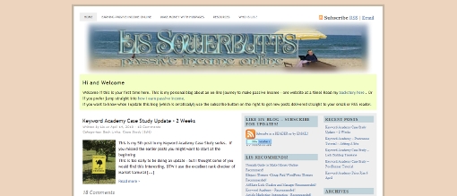
It took me a couple of hours – and I had written down the details of the design from the Thesis install. But I now have a site which at least resembles what this blog looked like with Thesis. I’m going to change it more – but I thought I would be too radical to start off with just so people didn’t think they’d wandered into the wrong site!

If you want the gory details of how I did the customisationisation without writing a single line of CSS code and very little html. This is the short version.
- I made sure that I had the custom header which was kindly given to me by Costa over at Blogigs: WP Easy Customization Tips.
- I trawled thru the custom CSS being used in Thesis plus the font and design options and wrote down little details like fonts and sizes and colour codes for the backgrounds, fonts and other shite.
- I installed Frugal 3.3
- I was impressed that Frugal preserved my existing sidebar arrangement complete with widgets.
- I easy fixed my top of page navigation which has been broken since I upgraded to Thesis 1.7.
- I had read the Frugal manual and watched Eric’s excellent videos so knew that I could use his custom widget functionality to add my yellow welcome box at the top of the page (I chose to change it so it was full width not just above the content column as in Thesis – it was easy to change by choosing a slightly different hook).
- I also used a custom widget to add a the blue box at the bottom of posts promoting The Keyword Academy.
- I have to go through each post and add a thumbnail. I wasn’t surprised – Thesis 1.7 was suppressing the WordPress 2.9 functionality of thumbnails so I knew I’d have to go back and fix a pile of posts. The good news is that from now on to add a thumbnail all i have to do is click that option when I import an image – not more cutting and pasting image urls yeah!
So far there are two things that I can’t find a way to reproduce with Frugal:
I quite like the single post followed by excerpts of older posts which Thesis does. Frugal well let me have 3 excerpts below the main post – but I haven’t found a way to do more than three (without code – I’m sure I CAN do it with code but that’s not the point)Confirmed by Eric (the developer and owner of Frugal) that I will need to look at a slightly different layout – given that some of you commented you hadn’t realized I’d changed themes thats cool;- T
he comments on pages appear to have gone AWOL – not sure how to get them back!Answer go to the “main options” page and select comments on pages and posts options – duh!

31 replies on “Passive Income Online – Now Running Frugal Theme!”
WOW! Good job Lis. You beat me to it.
I’m still in the consideration stage and lately, I am seeing how the Headway Theme lets you customize your theme and see the changes in real time. Really suoer cool!
I recently went through the whole dilemma of a new WP theme and I looked at all the options. In the end I went with Headway and I’m really happy with it. It allowed me to create exactly the look I wanted for the first time. I made a video of me messing around with it’s design features. http://www.youtube.com/watch?v=7BAD-oPRI4k
Naomi that’s an excellent review of Headway – people should check it out if they are interested and then take Naomi up on her discount code offer! I found out about headway after I found frugal and thought about reviewing it too – but doing 3 way comparisons is way harder than 2 way ones – though I might do that in the future!
Thanks Lis :). I really found choosing a theme to be a tough decision, but after I settled on Headway, I never looked back.
I looked long and hard at Headway (but without actually buying it). The thing that makes me nervous is the GUI – they tend to be hard to maintain and can get slow. If I hadn’t found Frugal so easy I would have moved on to headway – but I am pretty happy with Frugal – particularly with the ability to produce client sites easily
Looking good so far Lis (except a minot confusion factor in the second paragraph …
I think you meant the second “Thesis” to say “Frugal”.
I’ll be interested in reading the promised long explanation post, because I have toyed with the thought of buying either theme several times, but have backed away because of perceived complexities as well as slow load times.
Thanks Dave got it! That’s cool the block quotes colours works in the comments too – do you like the candy stripe effect in the comments?
Hmm looks like the strike thru font not working wasn’t a Thesis thing – must be the WP visual editor – I can do strike thru in the html view but not the “pretty” view – anyone else noticed that?
The strike though seems to work fine from this end (FireFox). I’m not sure what you mean about the “Candy Stripe” effect … do you mean where comments with a reply are highlighted slightly from the other comments?
I got strike thru working by using the html view and saving – if i use the visual editor it looks oK but disappears on the save *shrug*
Your first comment came in with a pink background (its a reply) this one has a grey background because the white/grey alternates – doesn’t that show on your FF (I did actually check mines OK in chrome/fF/IE – but it might be a monitor thing)
No those effects are there, I didn’t connect your words with the subtle color highlights is all. All looks good from here.
I never liked Thesis Lis. I use it on my Load Of Bullshit blog (very apt I thought) because I didn’t want it to go to waste. It also worked well to let people see the difference between the Thesis and my current theme, which I use on all my other blogs, which is resulting in a constant stream of sales.
So, at least Thesis wasn’t a total loss. 😉
LMFAO Sire – yes I kept it here on the same logic – I had paid for it! But I wanted something that was realy flexible which is why I stuck with a framework – Thesis is on the right track – its just they go overtaken by others!
Do you find the top banners convert well for you? I am going to redo the front page here when my audience has got used to the change!
Lucky for me I have a blog that I can still use it on. As for the banners, two of them do, the others I rotate when I get the time.
Well done, Lis! I am just getting used to Hybrid on a new site, I love playing around with themes, I waste far too much time with it. Just one little thing: Your site looks fine on my laptop screen, but on my old desktop monitor it is just a bit too wide and I have to scroll to see everything on the right side. That was also the case when you had Thesis btw, SY
Thanks SY – I haven’t changed the width – its dicated by the header graphic’s width really. Hmm not sure if its worth changing or not – the right sidebar isn’t that important (ie it doesn’t have affiliate links in it LOL) !
If you want I can adjust the header for you and send you the new version by email, I am quite good with Photoshop 😉 SY
Hi Lis,
Yes, the width is a few pixels too wide for a 1024 x 768 monitor (which seems to be about 40 percent of what people use).
As far as slow loading goes, that’s about (in a couple of weeks) to be a thing of the past when Quick Cache starts doing pre-caching. Except for those who insist on dynamic stuff like popularity contest.
I must admit RT that I avoid caching plugins – I had some issues that were very hard to troubleshoot ages ago on a site and haven’t really seen the point – upgrading from Thesis 1.5 solved this site’s speed of loading problems
I look forward to seeing the reasons behind the change as I run on Thesis and am happy with it at the moment. I’ve yet to update to 1.7 as I have a javascript menu with all my links on in the sidebar so I need to figure out how to transfer that over to 1.7.
Glad you have shrunk the width though, I’m on a netbook so 1024 pixels wide – had to scroll left to right previously
I haven’t changed the width I don’t think Rob! Must be your end! Aren’t you finding older Thesis slow? That’s why I upgraded to 1.7 – and give it its due that did fix the site’s speed problems.
[…] the end I spent a couple of hours customising Frugal to look like the Thesis version of my website used […]
Hey, pretty impressive, didn’t notice you changed it at all, to a totally different theme! Except, I have to scroll right to see the rest of the sidebar since I’m using a netbook. Either your site has always been like that, I probably didn’t notice it before.
Just double checked Lorna – the site is still 940px wide and was with Thesis too. What might be fooling you is that the yellow welcome box extends the width of the blog – I might go and change that now if people are on narrower screens!
There we go yellow box is now just above the post’s col rather than right across the width – is it really clueless to ask what width I should be designing my site for?
That is why I love fluid lay-outs, but if you insist on having a fixed width, I would check in GA what the screen resolution of most your visitors / readers is and take it from there 😉 SY
Hi Lissie,
You did a good job keeping the look of your site not too different. I think I clicked over from one of your links a few weeks ago and looked at Frugal. I can see why you like it. I’m a fan of frameworks too, but like SY I don’t mind playing with the code, so Hybrid is what I use on most of my sites right now. But if I was going to buy something, this looks pretty flexible and easy to use. 🙂
Cool – I wouldn’t have noticed the difference at first, but then I saw the comments – I like how they use different colours. I had always wondered if Thesis lives up to the hype – so many people seem to love it.
The only thing I see wrong (which I think was the case when you had Thesis too) is that the Category drop down box is extending outside the border of the page.
I’ve never bought a theme so far, although I’d be open to it if I found one I really like. My current favourites are Arras and Arthemia. I’ve got Hybrid on one of my sites – it looks nice but I find it frustrating to edit because it uses hooks & everything is in places I wouldn’t expect (I’m one of those people who actually likes playing with the code – I’ve yet to find a theme that is exactly as I want it right out of the box. I suppose I should spend less time fiddling with things most people will never notice, & more time creating content & links lol)
Yeah the category box is my fault my “passive income Australia NZ” is too long – it broke both themes 🙂 Must admit Frugal has a huge downside for me – its way too easy for me to keep on fiddling with design instead of getting more links!
You did a very good job getting it to look like it already did. I don’t think I would have even noticed that you changed themes if you wouldn’t have posted this. Maybe because of the comments looking different but I probably would have just thought you changed the format.
LOL Trent – I did spend 30 minutes trawling thru Thesis and writing down absolutely every value for colours and fonts and styles that I could find! I wanted to at least do the same as a starting point but I will probably start fiddling now!