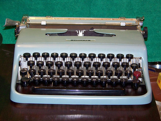
My ebook formatting business is quietly growing, and as I experience how others do their formatting – I cringe – like seriously. I know I started typing on a typewriter, but in 2013 when carbon paper would be unrecognisable to many, and most people don’t know that we had to physically move the typewriter carriage back to the start of a line and the innovation of electricity and a return key that did it AUTOMATICALLY was COOL it’s surprising how many still use Word Processors like the typewriters, they’ve never known.
So just, don’t okay. You know when you shout and swear at the Word Processor cause it does weird stuff when you don’t want it to? Actually, it’s not the computer, it’s you. You have so many odd, inconsistent , and plain wrong invisible formatting symbols, you gave the software a headache, so it’s passing that pain on to you.
When I format for non-fiction, particularly I strip out almost all of this junk, but it’s no surprise at all to me if your file does weird stuff in the Word Processor from time-to-time.
Or more specifically:
- don’t use multiple hits of the enter key to create spaces between headers or between paragraphs, or even -help us, to get a new page. Instead use Styles (every word-processor has them). If you want a paragraph indented (and you should ONLY want this if you are writing fiction) or a space after the paragraph, use a style.
- don’t use tabs to create indents or columns or tables. Really. Tables are just-about supported on Kindles these days, but keep it very, very simple folks. If you want a fancy table – make a screen shot of it and include it in your book as an image.
- want a heading? Use a heading style. Really no bold, italic, don’t add a special font, just use a style. That way, if you suddenly decide that your 29-chapter magnus opus requires a Palatino 33 as a chapter font – you can add it, in one place, not 29. Actually don’t bother because an eReader won’t honour your fonts or character sizes, but if you want to make sure your chapters are centered or always start on a new page – modify the style, not each and every chapter.
Now if you are formatting for an eReader (Kindle or otherwise) – make sure you don’t do the following:
- don’t include page numbers, anywhere. Page numbers don’t exist on an eReader. So no page numbers in the table of contents, in the text (as in see figure X on page Y – instead add a hyperlink to the figure)
- do redo your “front matter” – it shouldn’t be the same as your print edition – because, well it’s not print! And remember that the first 10% or so is what the browser can see for free on Amazon – make it a good 10%, i.e . make sure it covers your table of content (for non-fiction) or enough of your first chapter (for fiction) to hook the reader. Move the dedication to your cats, and the acknowledgement for the support of the Prisoner’s Rehabilitation league to the back. I know a lot of people put in glowing “reviews” from “famous people”. Unless those are really famous people, I’d give that a miss to, let your writing stand on its merits, or at least give the customer a chance to read some of it!
Front Matter For eBooks – My Recommendation
All of this is centered and on one page
- Title – in H1
- Sub-title in H2
- several spaces (use <br/> tag in HTML)
- author name (note no “by” )
- author’s website (an active link so people can click through from the free sample…)
- Copyright 2013 author name all on a single line
- new page
- linked table of contents
- introduction to the book
I fiddle a bit to get this all to fit on single page in the Kindle Previewer for the Kindle Touch or PaperWhite. If they fit on that they will fit on the Fire. They won’t fit on a phone, but them’s the breaks for using such a small device IMHO.
If I am formatting for distribution via Smashwords then I add the line “Smashwords Edition” under the copyright notice. If it’s an ePub being distributed to Apple you will also need to include an ISBN in which case I give up trying to fit it all on the one page and do something like this:
- after the author’s website force a new page and add
- Copyright 2013 author name all on a single line
- ISBN
- Disclaimer – something funny along the lines that although I’ve made every effort you’re still responsible for your own life (that’s for non-fiction). For fiction you could do the “this is a work of fiction and any similarity to any persons dead or alive is just a result of your own twisted narcissistic mind, and so not he author’s problem”.
Back Matter for eBooks
This is where you get to do a sale’s pitch. I don’t care whether you consider yourself a marketer or not – you still need to do this. Basically if the buyer got to the end of your book, they must have actually read it (unlike a paper book is fairly hard to just flick to the end). Give them something there: suggestions include:
- Author bio and photo – they may actually want to meet you now! Include an email so they can contact you. Link to social media and websites.
- More by you – if you have more books – now is a good time to promote them – I add a the cover image and the same blurb I use on Amazon plus a link to Amazon (note: if you are distributing this to Smashwords you can’t link to Amazon – just ask the reader to search for your titles at their favourite eBook retailer)
- If you don’t have more books, and even if you do, direct readers to a page on your website which consists of a welcome message and a sign up form for an email service like Aweber or MailChimp (A little like the one at the bottom of this post – but I keep it as a separate list as I know this person is actually a BUYER not just a web-site reader).
- A request for a review. Yup – most people don’t know that reviews are important to authors, so tell them, and ask, nicely.
- Oh yeah the dedication and acknowledgement – you can add those here too.
Don’t Bother With The Following Formatting for eBooks
- font and size – neither of these are under your control, leave them alone and let the user choose what they want use the header styles (h1 through h6) to get larger and smaller sizes
- footnotes work fine and will flow to the end of the page, chapter or book as you decide
- bold, italic, sub-script and super-scripts all work fine as well
- drop caps don’t work on older eReaders (try bold or all caps instead)
- most eReaders now default to full justification, if you are getting oddly spaced lines it’s usually because of a long URL – consider using a link shortner (eg. bit.ly) or put the url on its own line.
- remember the author pays for downloads by the MB so only include images that you NEED.